



Case Study
VITARIS Senior Wellness System
Premium Structural Packaging Design for Senior Nutritional Supplements
0. Introduction
In today’s nutraceutical and healthcare markets, packaging is no longer merely a protective container. It has evolved into the first tangible touchpoint between a brand and its consumers. Particularly in health-related categories such as senior wellness supplements, packaging plays a critical role in establishing trust, communicating quality, enhancing perceived value, and influencing purchasing decisions.
The VITARIS Senior Wellness System is a conceptual design study developed within the field of Premium Medical Packaging Design, with the objective of reimagining the packaging experience for specialized nutritional supplements targeting older adults. The project was created by PVISUAL, a design consultancy and packaging engineering studio specializing in product identity development, structural packaging design, and user-centered brand experiences.
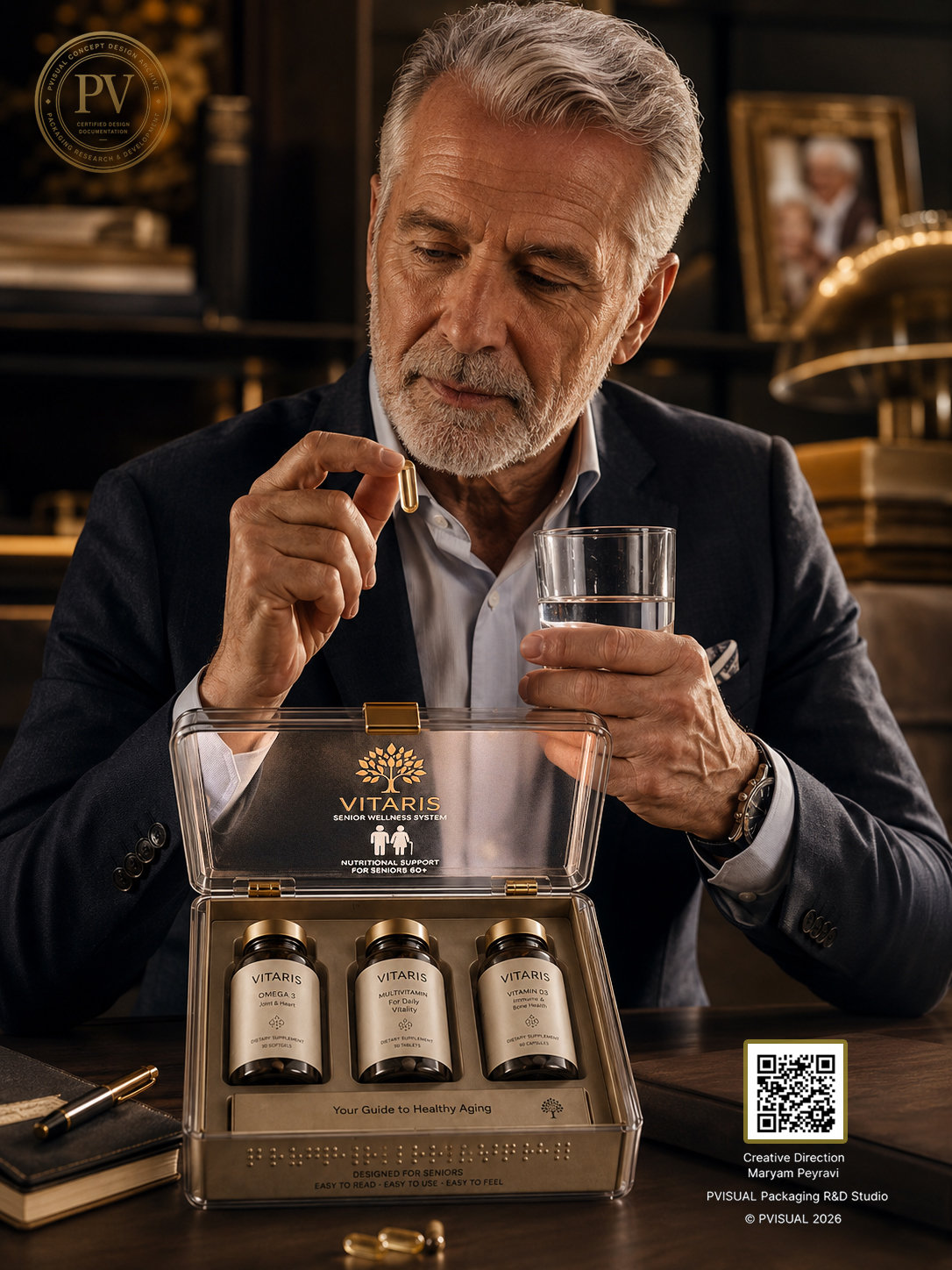
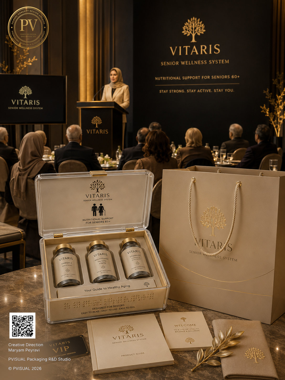
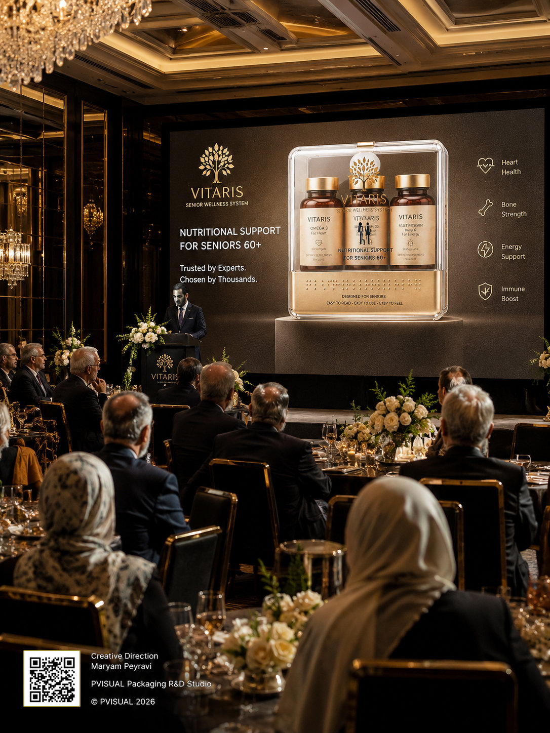
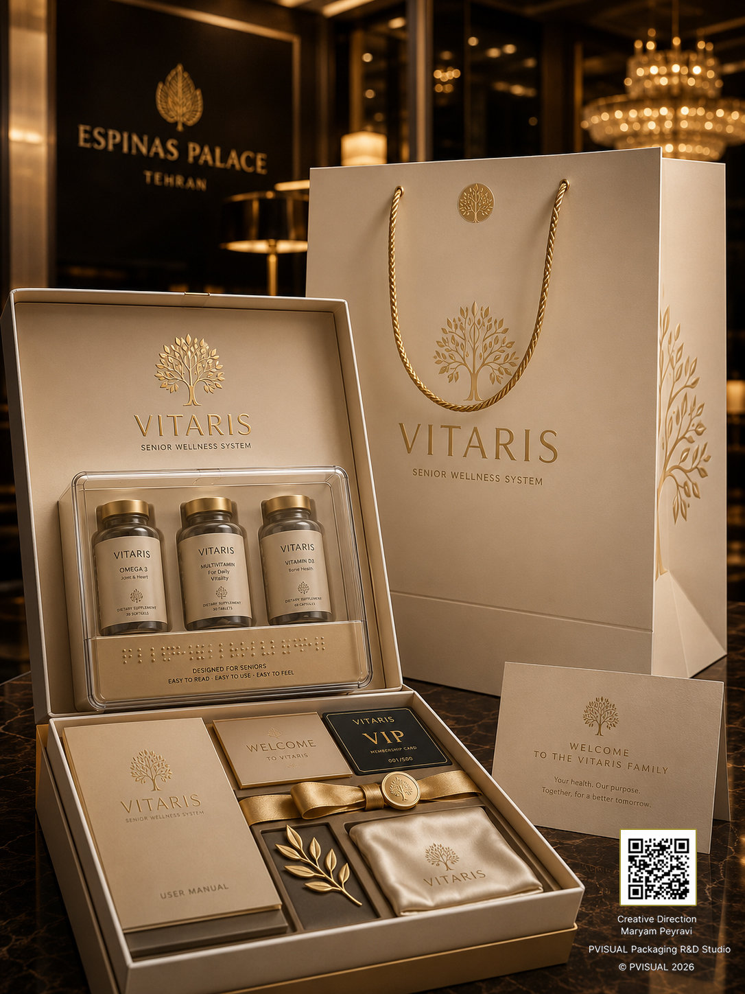
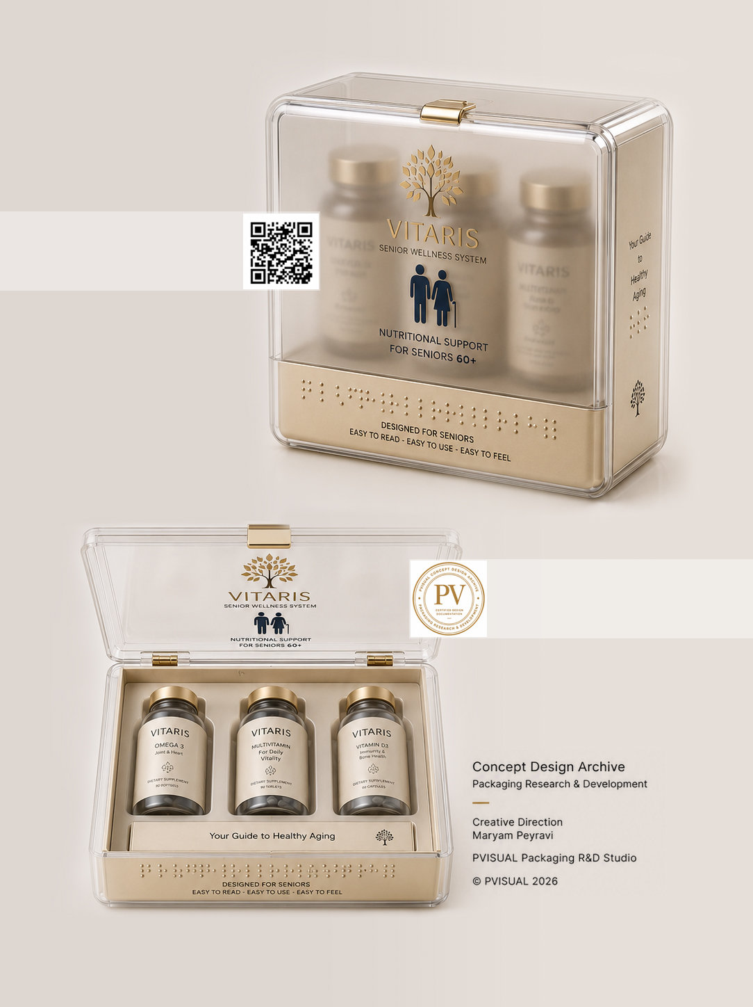
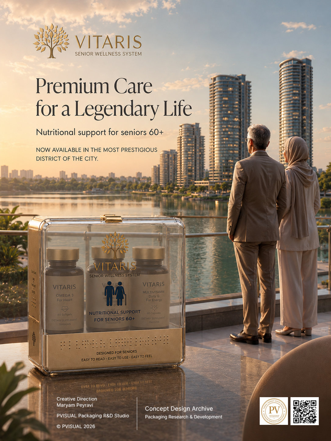
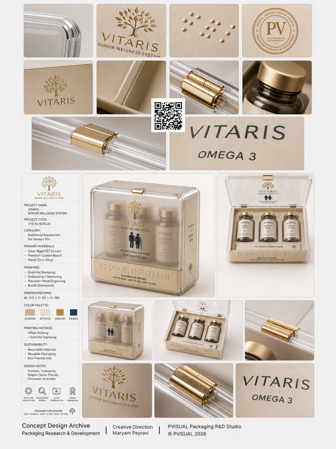
As demonstrated throughout the project visuals, the development process extended far beyond the design of a single package. Instead, it was conceived as a complete brand ecosystem encompassing structural packaging architecture, material selection, engineering documentation, technical specification sheets, exploded views, retail presentation scenarios, brand event applications, supporting collateral, and customer experience storytelling.
At the core of this study was a fundamental question:
How can a specialized senior wellness supplement be packaged in a way that simultaneously communicates medical credibility, premium quality, export readiness, and a refined human-centered experience?
To address this challenge, PVISUAL approached the project not simply as a graphic design exercise, but as a multidisciplinary packaging development process. Acting as both a Packaging Consultant and Packaging Engineering Studio, the team explored the project through the lenses of structural architecture, component engineering, material strategy, user experience design, and commercial value creation.
This case study illustrates how packaging design can evolve into a strategic business asset—one capable of strengthening consumer trust, elevating brand positioning, enhancing customer experience, and preparing products for international markets. Even at the Concept Design stage, before entering industrial production, packaging has the potential to become a powerful tool for long-term brand differentiation and market growth.
1. Challenge
Designing packaging for senior wellness supplements involves far more than creating an attractive visual appearance. Products within this category exist at the intersection of healthcare, trust, engineering, user experience, and intense market competition. Consequently, packaging must function simultaneously as a protective system, a brand communication platform, a differentiating factor, and a trust-building mechanism.
The VITARIS Senior Wellness System was developed in response to a series of challenges commonly encountered by health supplement brands seeking to enter premium and export-oriented markets.
1.1 Market Challenge
The global nutritional supplement industry—particularly the senior wellness segment—has experienced significant growth in recent years. Rising life expectancy, an expanding population aged 60 and above, and increased awareness of preventive healthcare have transformed this category into one of the most competitive sectors within the healthcare industry.
In this environment, consumers are no longer purchasing supplements solely for their functional benefits. They increasingly expect products to demonstrate superior standards of quality, safety, scientific credibility, and user experience.
Despite this shift, a large proportion of supplement packaging still relies on traditional formats: standard folding cartons and conventional plastic bottles that adequately protect the product but often fail to communicate premium value, brand differentiation, or a memorable user experience.
One of the primary objectives of the VITARIS project was therefore to create a packaging architecture capable of immediately communicating the positioning of a Premium Wellness Brand from the very first visual interaction.
1.2 Trust Challenge
Trust is arguably the most critical factor influencing purchasing decisions in the healthcare sector. Long before consumers evaluate ingredients, formulations, or clinical claims, they subconsciously assess product quality through packaging appearance, material quality, structural organization, and presentation standards.
Poor graphic execution, low-quality printing, weak structural integrity, or inexpensive material choices can unintentionally signal lower product quality—even when the formulation itself meets high standards.
For this reason, one of the project’s central challenges was transforming packaging into a vehicle for trust communication.
This objective was pursued through a series of deliberate design decisions, including:
Clean, engineered structural forms.
Controlled transparency to reveal the product while maintaining visual sophistication.
A restrained palette combining medical neutrality with premium gold accents.
Organized bottle placement within a dedicated internal tray system.
Highly legible typography and information hierarchy.
Braille integration to support accessibility.
A carefully designed opening experience that reinforces perceptions of precision, care, and quality.
Within this framework, packaging becomes the brand’s first ambassador, establishing confidence before the product is even consumed.
1.3 Competitive Challenge
Most supplement brands compete within highly crowded retail environments characterized by similar visual languages—plastic bottles, standard cartons, and comparable graphic systems.
The consequence is reduced shelf differentiation and increased difficulty for consumers attempting to distinguish between competing products.
For VITARIS, the goal was not simply to create an attractive package but to establish a comprehensive identity system capable of standing out in:
Premium pharmacies
Specialized clinics
Wellness retailers
Supplement boutiques
International export channels
As a result, the project expanded beyond package design into the development of a broader brand ecosystem incorporating packaging architecture, supporting materials, technical documentation, presentation systems, event applications, and cohesive visual storytelling.
This approach positions the brand not as a standalone product, but as a complete Wellness Experience.
1.4 Structural Packaging Challenge
One of the most significant challenges in designing packaging for senior wellness supplements is balancing aesthetics, functionality, and manufacturability.
The packaging structure must protect the bottles from impact while simultaneously providing:
Intuitive opening and closing mechanisms.
Easy accessibility for senior users.
Efficient internal organization.
Durability for repeated use.
Potential for secondary life beyond product consumption.
Based on the project documentation and visual studies, this challenge was addressed through the development of a rigid packaging system featuring:
A transparent outer enclosure.
Secure closure mechanisms.
A custom-engineered molded tray.
Precisely positioned bottle compartments.
Reusability after product consumption.
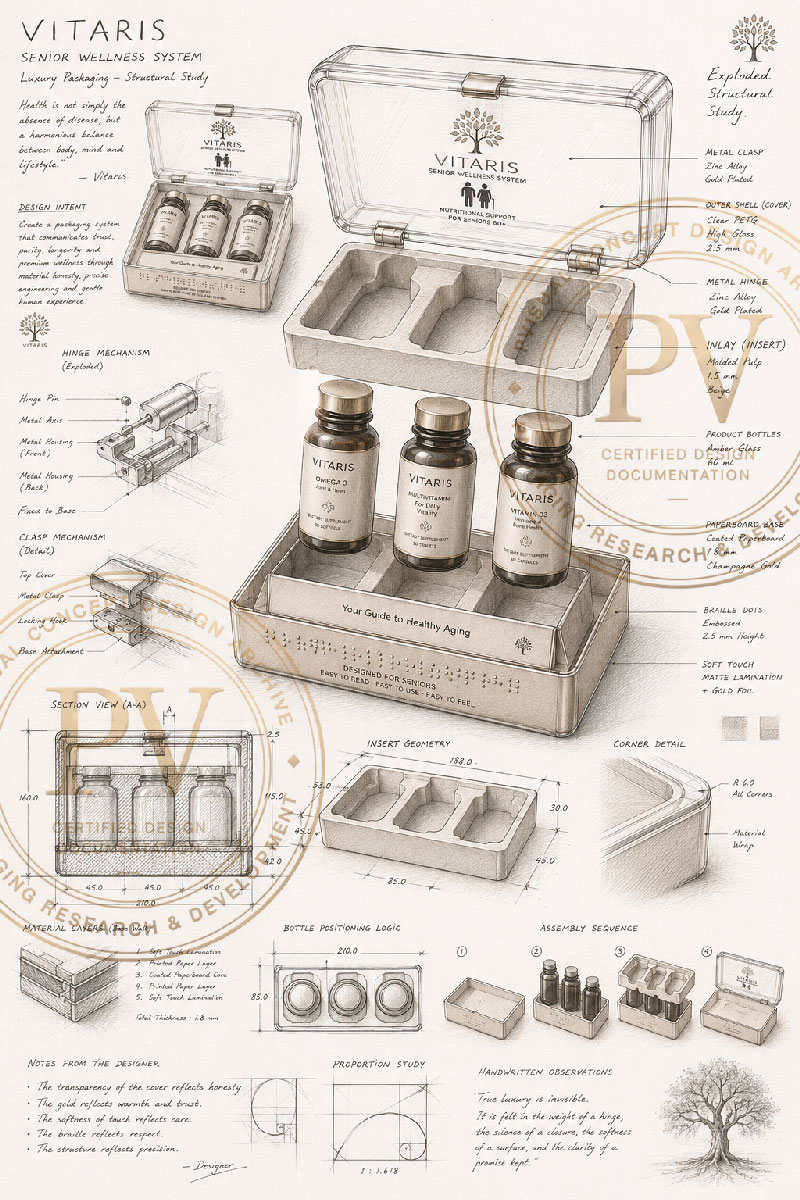
Furthermore, the inclusion of engineering sheets, exploded views, component analysis, material specifications, and technical documentation demonstrates that the project was developed with a genuine Packaging Engineering mindset rather than a purely aesthetic focus.
Ultimately, the challenge was not simply to create a new package. It was to design a structural solution capable of simultaneously satisfying functional requirements, user expectations, brand objectives, and the demands of premium and export-oriented markets.
Through this approach, VITARIS evolves from a product package into a comprehensive system designed to generate trust, enhance perceived value, and support long-term brand growth.
2. Market Analysis
Packaging design within the nutritional supplement industry has evolved beyond aesthetics to become one of the most influential competitive tools available to brands. In the senior wellness category, purchasing decisions are rarely based on formulation alone. Factors such as brand credibility, perceived quality, usability, structural design, accessibility, and shelf presentation increasingly influence consumer choice.
Prior to developing the VITARIS Senior Wellness System, market analysis focused on four key dimensions:
Consumer behavior
Global packaging trends
Competitive landscape
Market opportunities for premium healthcare brands
2.1 Consumer Behavior Analysis
Consumers purchasing health and wellness products—particularly individuals aged 60 and older, as well as their family members—place exceptional importance on trust signals.
In many cases, perceived product quality is formed before ingredient panels or scientific claims are reviewed.
These consumers typically seek products that simultaneously communicate:
Safety and medical credibility
High manufacturing quality
Ease of daily use
Readable information hierarchy
Organized product presentation
Storage convenience
Professional and trustworthy aesthetics
Additionally, a significant percentage of purchasing decisions are often made by adult children or caregivers. Consequently, packaging must satisfy the functional needs of seniors while also conveying quality and value to younger decision-makers.
The VITARIS concept responds to these insights through transparent materials, a minimalist design language, precise internal organization, highly legible typography, and accessibility features such as Braille integration.
Together, these elements create an experience that communicates care, confidence, and reliability.
2.2 Packaging Design Trends
Analysis of global healthcare and premium packaging trends indicates a clear movement toward the integration of aesthetics, functionality, and user experience.
Leading brands increasingly differentiate themselves not only through graphics but also through structural innovation, material selection, and engineered user interactions.
Several trends significantly influenced the development of this concept:
Structural Packaging Design
Packaging architecture has become an extension of brand identity.
Form, opening mechanisms, internal organization, and reusability contribute directly to perceived value and customer engagement.
Transparent Material Strategy
Transparent and semi-transparent materials provide controlled product visibility while reinforcing perceptions of honesty, authenticity, and quality.
This principle serves as one of the defining design characteristics of the VITARIS concept.
Premium Unboxing Experience
The act of opening the package has become an integral component of brand experience.
Rigid packaging systems, engineered inserts, and organized product presentation contribute to stronger emotional engagement and enhanced value perception.
Inclusive Packaging Design
Accessibility has become a growing priority within healthcare packaging.
Features such as:
Readable typography
Clear visual contrast
Easy-open mechanisms
Braille communication
are increasingly viewed as essential rather than optional.
Brand Experience Ecosystems
Premium brands no longer rely on packaging alone.
Instead, they create integrated ecosystems incorporating packaging, literature, promotional materials, retail displays, educational content, and customer touchpoints to deliver a cohesive brand experience.
3. Strategy
Within the healthcare market, scientific formulation alone is rarely sufficient to create sustainable competitive advantage. While many brands offer similar nutritional compositions, what ultimately differentiates them is the experience they create through branding, packaging, and product presentation.
For the VITARIS Senior Wellness System, the strategic foundation was built upon a simple principle:
Packaging should become part of the product’s value—not merely a container for it.
Accordingly, the project was developed around four interconnected strategic pillars:
Brand Strategy
Trust Strategy
Premium Positioning Strategy
Scientific & Medical Communication Strategy
3.1 Brand Strategy
The primary objective was to establish a distinctive identity for a wellness supplement brand capable of occupying a premium position within consumers’ minds.
The VITARIS brand concept is built upon three core values:
Long-Term Wellness
Premium Quality
Human-Centered Care
These values are consistently expressed throughout every aspect of the project—from logo development and color strategy to packaging architecture and product presentation.
Unlike many supplement brands whose visual identities focus almost exclusively on product information, the VITARIS concept transforms packaging into an integral part of the brand story.
Controlled transparency, restrained gold detailing, generous white space, geometric order, and minimalist architecture work together to communicate credibility, sophistication, and long-term trust.
The broader brand ecosystem—including shopping bags, information booklets, welcome cards, exhibition materials, and retail presentation systems—further reinforces the perception of a complete wellness experience rather than a standalone product.
3.2 Trust Strategy
In healthcare, trust represents the most valuable brand asset.
Consumers cannot independently verify scientific efficacy at the point of purchase. Instead, they rely on visual and physical cues to evaluate credibility.
For VITARIS, trust is not communicated through marketing claims. It is embedded within the design itself.
Key trust-building mechanisms include:
Product Transparency
The transparent package enclosure allows controlled visibility of the bottles, reinforcing honesty, authenticity, and confidence.
Structural Organization
The precise arrangement of bottles within a dedicated tray communicates discipline, control, and attention to detail.
Reliable Design Language
Soft edges, engineered closure systems, and premium materials contribute to perceptions of durability and professionalism.
Accessibility
Braille integration, readable typography, and senior-friendly usability demonstrate that the design addresses real user needs rather than prioritizing aesthetics alone.
Within this strategy, trust becomes the outcome of thoughtful design execution rather than promotional messaging.
3.3 Premium Positioning Strategy
A key objective of the project was to move beyond the conventional visual language associated with pharmaceutical products and align more closely with contemporary premium wellness brands.
In this context, luxury is not defined by excessive decoration but by precision, restraint, and quality.
The premium strategy is built around several principles:
Purposeful Minimalism
Unnecessary visual elements were removed in favor of clarity, white space, and focused communication.
This results in a calm, professional, and timeless appearance.
Premium Material Expression
The combination of transparent surfaces and refined metallic details communicates quality without relying on complex decorative treatments.
Premium Unboxing Experience
The opening sequence, bottle presentation, internal tray architecture, and overall product organization create an experience more commonly associated with luxury consumer products.
Reusability
The durable rigid structure allows the package to continue serving as a storage container after the supplement has been consumed, extending both practical value and brand presence within the user's daily environment.
Within the VITARIS concept, luxury is defined not by price, but by the quality of experience delivered throughout every interaction.
3.4 Scientific & Medical Communication Strategy
While creating a premium experience was a central objective, scientific credibility could never be compromised.
The design language was therefore developed around a careful balance between medical authority and premium aesthetics.
This balance is achieved through:
Scientific Visual Identity
Clear typography, disciplined information hierarchy, and the avoidance of unnecessary graphic elements create a professional healthcare-oriented appearance.
Controlled Color Strategy
Neutral tones, transparent materials, and selective gold accents establish a premium presence while preserving medical credibility.
Engineering as a Brand Asset
Technical documentation, structural analysis, exploded views, and engineering specifications reinforce the notion that the project is grounded in functional logic and industrial feasibility rather than aesthetics alone.
Expertise-Led Storytelling
Across every touchpoint, the project communicates a consistent message:
Product quality is strengthened through responsible design, engineering precision, and a deep understanding of user needs.
Packaging functions as a communication medium that conveys expertise, care, and professionalism without relying on exaggerated claims.
Strategic Conclusion
The strategic framework of the VITARIS Senior Wellness System is founded upon a single guiding principle:
Packaging should be an integral component of product value rather than a secondary protective layer.
Through the integration of Brand Strategy, Trust Strategy, Premium Packaging Design, and Scientific Communication, the project establishes a foundation for a wellness brand capable of competing within both domestic and international markets.
Every design decision—from material selection and structural architecture to unboxing experience and visual identity—serves a unified objective: enhancing perceived value, strengthening consumer trust, and creating sustainable differentiation within an increasingly competitive healthcare landscape.
4. Structural Design
In health-related packaging design, the physical structure is not merely responsible for product protection; it is also a core component of brand experience, design language, and perceived product quality. For this reason, in the VITARIS Senior Wellness System project, structural design was established as one of the fundamental pillars from the earliest stages of development.
Based on conceptual visuals and engineering sheets, the project was developed under the principles of Structural Packaging Design and Packaging Engineering, where form, function, ergonomics, manufacturability, and user experience are integrated into a unified system.
4.1 Packaging Architecture
The packaging architecture is based on the concept of Protect – Present – Preserve, meaning a structure that simultaneously protects the product, presents it with value, and allows for continued use after purchase.
Unlike conventional cardboard supplement packaging, this project is built around a rigid structural case, visually referencing advanced medical equipment and premium healthcare products.
Key architectural characteristics include:
A unified and impact-resistant structure for bottle protection
A transparent body enabling controlled product visibility
A balanced rectangular geometry
Softened edges to improve ergonomics
Symmetrical composition to enhance precision and order
Reusability as a storage system
This architecture transforms the packaging into an everyday object, increasing perceived brand value.
4.2 Opening & Closing System
The opening mechanism is one of the most critical touchpoints in user interaction, directly shaping the first physical impression of the brand.
In the VITARIS project, the system is designed around three core principles:
Ease of Use
The packaging is designed for elderly users, requiring minimal force and no complex interaction. The lid movement is smooth, predictable, and ergonomic.
Product Protection
Once closed, the structure ensures stability against impact, dust, and daily movement.
Premium Interaction
The soft motion of the lid and precise mechanical alignment create a premium, engineered experience.
The system is adaptable to multiple mechanisms such as magnetic closure, hinge systems, or mechanical locking in future production phases.
4.3 Modular System
The internal structure is designed as a modular system rather than a single enclosure. Each module performs a specific functional role:
Outer Protective Shell: Provides structural protection and brand identity
Transparent Cover: Enables controlled visibility and enhances trust
Internal Tray: Precisely holds bottles and prevents movement
Information Layer: Integrates product data and instructions
Brand Experience Components: Includes inserts such as manuals, cards, and additional brand assets
This modularity enables future product variations without altering the core architecture.
4.4 Internal Engineering
Unlike purely conceptual packaging designs, VITARIS emphasizes internal engineering logic.
Key engineering considerations include:
Precise bottle placement to prevent collision and vibration
Balanced weight distribution for stability
Mechanical protection through controlled spacing
Industrial assembly feasibility with minimal complexity
Compatibility with mass production processes such as injection molding and vacuum forming
The result is a system optimized for both performance and manufacturability.
5. Material Selection
In healthcare packaging, material selection is not only a technical decision but also a key element of brand identity and perceived value. Materials directly influence trust, hygiene perception, durability, and overall product quality.
In the VITARIS Senior Wellness System, material selection is based on four core criteria:
Medical trust perception
Premium perceived value
Industrial manufacturability
Tactile experience quality
5.1 Material Strategy
Material selection in this project is treated as a strategic branding decision rather than a cost-driven choice.
The goal is to balance:
Protection and durability
Premium visual appearance
Industrial production efficiency
As a result, a rigid packaging system based on engineered polymers and molded components was selected.
5.2 Material Logic
Outer Structural Case
Materials such as Polycarbonate (PC) or PETG are suitable due to:
High impact resistance
Optical clarity
Dimensional stability
Reusability
Internal Tray
Thermoformed PET or injection-molded PP ensures:
Bottle stabilization
Shock absorption
Efficient assembly
Bottles
Pharmaceutical-grade PET or HDPE provides:
Chemical resistance
Lightweight structure
Recyclability
Graphic Finishing
Techniques such as hot foil stamping, UV coating, and laser engraving enhance perceived value without visual overload.
5.3 Tactile Experience
Tactile quality plays a crucial role in premium packaging perception.
Key elements include:
Structural rigidity conveying durability
Combination of matte, glossy, and transparent surfaces
Precision assembly reinforcing quality perception
Ergonomic design suitable for elderly users
5.4 Medical + Premium Balance
The design achieves a balance between clinical credibility and premium aesthetics through:
Controlled transparency
Minimalist composition
Limited use of gold accents
Clean visual hierarchy
5.5 Industrial Manufacturability
The system is designed for scalable production using:
Injection molding for structural components
Thermoforming for trays
UV and screen printing for graphics
Automated assembly processes
5.6 Sustainability Considerations
The design supports:
Recyclable materials (PET, HDPE)
Reusable structural packaging
Reduced material complexity
Future integration of bio-based alternatives
6. Graphic System
The graphic system is a structured communication framework designed to deliver key brand messages within seconds. It balances medical credibility with premium aesthetics.
6.1 Graphic Strategy
The system is based on:
Purposeful minimalism
Clear visual hierarchy
High readability
Reduced cognitive load
Integration of structure and graphics
6.2 Typography
Typography ensures:
High legibility for elderly users
Clear information hierarchy
Modern, geometric brand personality
6.3 Color System
The palette includes:
White: purity, clarity, health
Gold: controlled premium accent
Gray/Silver: technological precision
Transparency: trust and openness
6.4 Iconography
The icon system is:
Geometrically simple
Functionally informative
Globally understandable
Structurally consistent with packaging
6.5 Visual Identity
The system balances:
Scientific credibility
Premium positioning
Minimal visual noise
6.6 Brand Consistency
The visual language extends across:
Packaging
Bottles
Technical sheets
Manuals
Retail materials
Presentation assets
7. User Experience (UX)
User experience extends beyond product use and begins at the shelf, continuing through daily interaction and reuse.
7.1 Shelf Experience
The design follows the principle:
“The product should not shout to be seen; it should stand out through design quality.”
It ensures:
Quiet visual impact
Immediate trust perception
Strong retail differentiation
7.2 Tactile Experience
Key elements:
Structural solidity
Premium surface variation
Ergonomic handling
Emotional trust through physical interaction
7.3 Unboxing Flow
The unboxing process includes:
Initial visual perception
Smooth lid opening
Organized internal presentation
Easy product access
Daily use integration
Post-use repurposing
7.4 Senior-Centered Design
Designed specifically for elderly users:
High readability
Low interaction complexity
Accessible structure
Reduced physical effort
Braille integration
8. Manufacturing
The system is designed for industrial scalability using DFM and DFA principles.
8.1 Mass Production Readiness
Key features:
Tooling-compatible geometry
Modular production system
Reduced assembly complexity
Scalable industrial processes
Manufacturing methods include:
Injection molding
Thermoforming
UV printing
Hot foil stamping
Automated assembly
8.2 Manufacturing Constraints
Considerations include:
Tight dimensional tolerances
Surface quality control for transparent parts
Uniform wall thickness
Efficient assembly design
Transport durability
8.3 Quality Assurance
Quality control includes:
Dimensional inspection
Visual surface evaluation
Functional testing of lid mechanism
Assembly verification
Packaging durability testing
8.4 Standards
Relevant standards include:
ISO 15378 (pharmaceutical packaging quality)
ISO 9001 (quality management)
ISO 18601 series (packaging sustainability)
GMP compliance
FDA / EU packaging guidelines (for export readiness)
8.5 Concept to Production Path
Final CAD development
DFM/DFA optimization
Material validation
Prototype development
Functional testing
Tooling design
Pilot production
Mass production
9. Business Impact
Packaging is positioned as a strategic business asset rather than a cost element.
9.1 Sales Impact
Increased shelf conversion
Higher perceived value
Support for premium pricing
Improved customer retention
9.2 Brand Trust
Trust is built through:
Structural order
Material quality
Transparent design language
Engineering documentation
9.3 Brand Equity
Brand value increases through:
Consistent identity system
Professional design documentation
Scalable product ecosystem
9.4 Export Readiness
The design supports:
Global visual language
Multi-language adaptability
Premium retail compatibility
B2B presentation use
9.5 B2B Value
Benefits include:
Stronger investor perception
Easier distributor onboarding
Reduced redesign costs
Scalable product line development
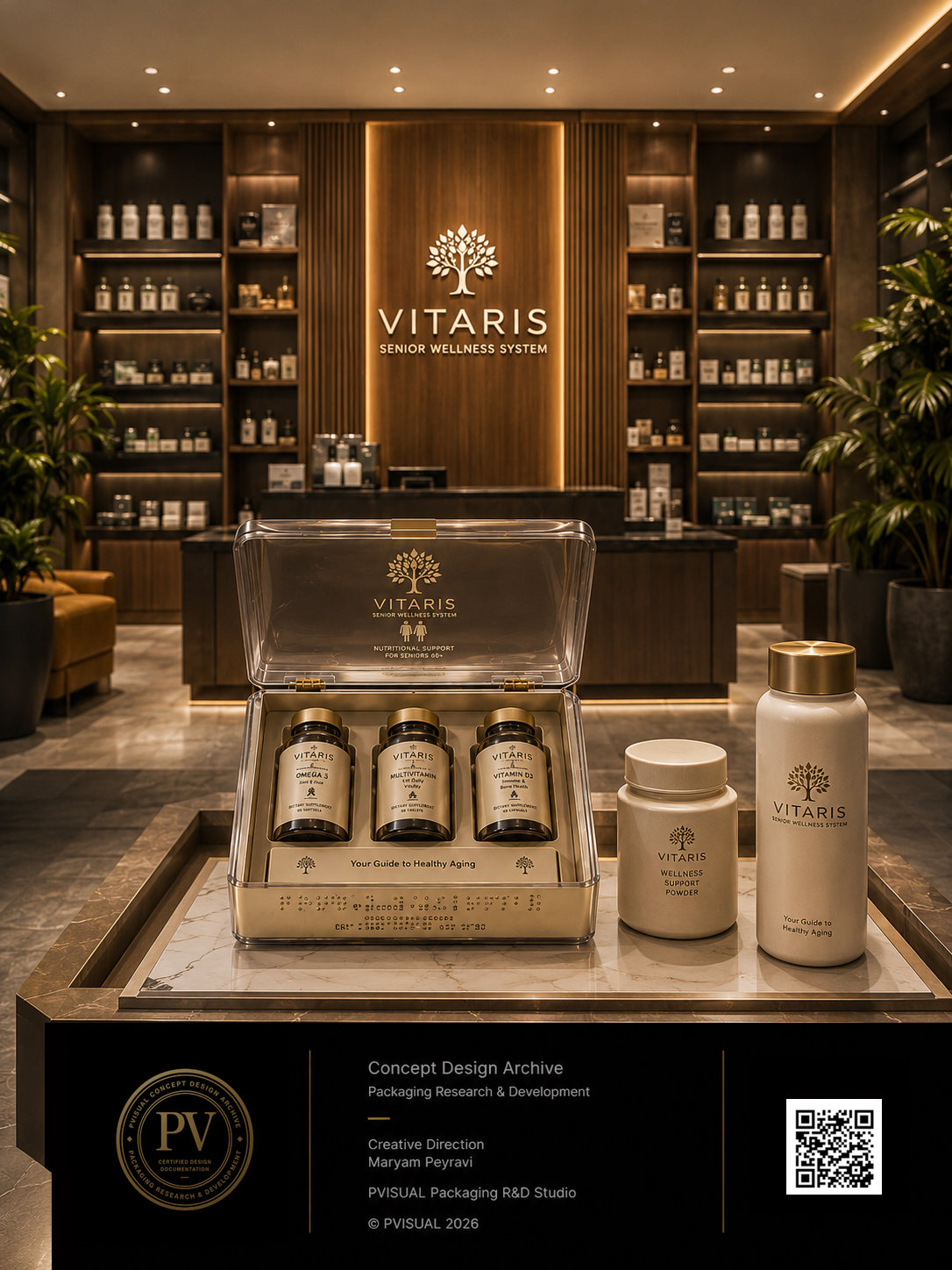
10. Premium Shelf Storytelling
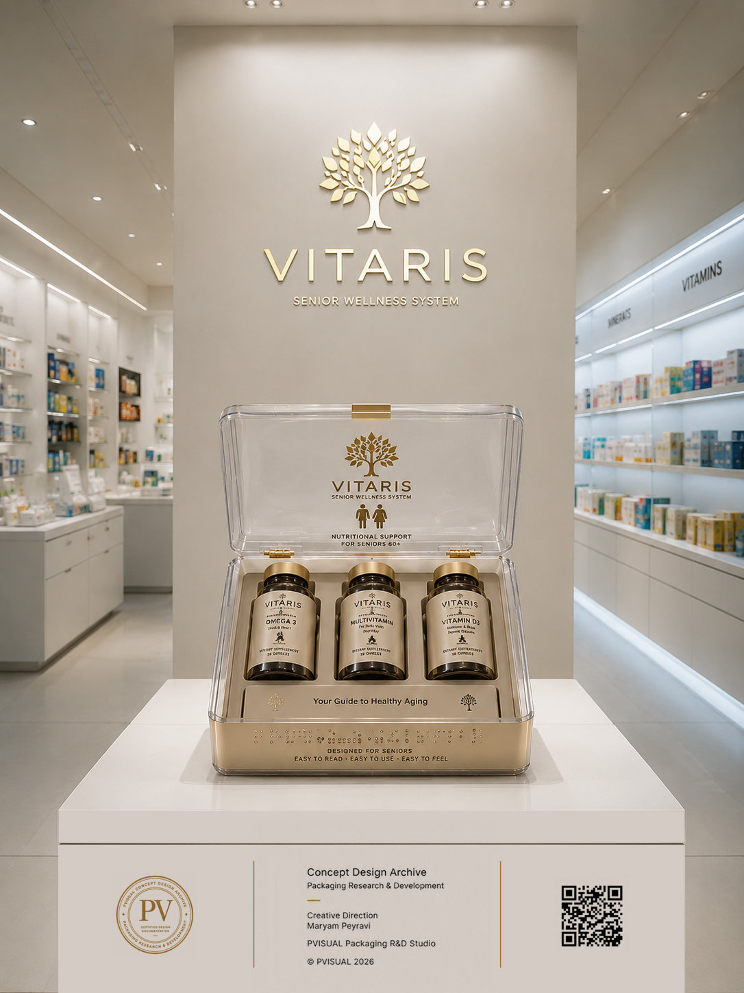
Shelf experience is treated as a brand communication medium where packaging, lighting, and arrangement create a unified perception.
10.1 Philosophy
The product should not compete through noise but through design clarity and confidence.
10.2 Retail Strategy
Eye-level placement in pharmacies
Structured grouping in premium stores
Full system presentation in exhibitions
10.3 Shelf Experience Design
Three stages:
Attention (form and structure)
Interest (material quality)
Decision (interaction and touch)
10.4 Luxury Perception
Achieved through:
Controlled spacing
Consistent repetition
Material contrast
Minimal visual clutter
10.5 Purchase Influence
Design reduces decision friction through:
Clarity
Trust cues
Readable structure
Premium tactile feedback
10.6 Brand Storytelling
Before reading any text, the product communicates:
Precision
Trust
Medical credibility
Premium positioning
10.7 Export Context
The system is designed for global retail environments but requires local regulatory adaptation before market entry.
FAQ
Is this project a manufactured product?
No. This project is a Concept Design developed through an integrated approach combining industrial design, packaging engineering, and brand development. Its primary purpose is to demonstrate the design process and its potential for future industrial production.
Is this packaging suitable for industrial manufacturing?
The structure of this project has been developed based on Design for Manufacturing (DFM) principles. However, full-scale mass production would require further engineering development, prototyping, technical validation, and tooling design.
Who is the target audience of this design?
This concept is intended for health supplement brands, pharmaceutical companies, investors, manufacturers, and businesses seeking premium, export-oriented packaging solutions.
Why is user experience important in this project?
Because packaging is not only a protective container; it is an essential part of the brand experience. Ergonomics, unboxing experience, information readability, and accessibility all directly influence trust and perceived product value.
Is this design suitable for international markets?
The design language, information architecture, and packaging system have been developed with a global perspective. However, regulatory compliance, labeling requirements, and regional standards must be adapted individually for each target market.
Business Layer (Executive Summary)
This case study demonstrates how an integrated approach across branding, structural design, material selection, packaging engineering, and user experience can significantly enhance perceived product value.
The VITARIS project was developed as a premium packaging system for senior wellness supplements and serves as an example of export-oriented design. It is suitable for B2B presentations, investor pitches, and brand development strategies.
Design Layer (Summary)
The design is based on a rigid packaging architecture combined with transparent materials, a minimal graphic system, a medical-inspired visual identity, senior-centered accessibility principles, and a structured unboxing experience.
All components are designed to achieve a balance between scientific credibility and premium brand positioning, resulting in a cohesive and scalable packaging ecosystem.
Engineering Layer (Summary)
The project includes structural analysis, modular system design, material evaluation, manufacturability considerations, technical documentation, and exploded views of internal components.
At the same time, it must be emphasized that this is a Concept Design, and prior to industrial production it requires detailed engineering completion, prototyping, functional testing, and manufacturing validation.
Portfolio Layer
Key Features of the Project
- Premium Medical Packaging Design
- Structural Packaging Engineering
- Rigid and Reusable Packaging System
- Premium Shelf Impact Strategy
- Luxury Healthcare Branding Approach
- Industrial Design Documentation
- Export-Oriented Design Strategy
- Packaging Ecosystem Development
- Concept-to-Production Roadmap
Recommended References
ISO 15378 — Primary Packaging Materials for Medicinal Products
ISO 9001 — Quality Management Systems
ISO 22000 — Food Safety Management Systems
ISO 18601 Series — Packaging and Environmental Sustainability
Good Manufacturing Practice (GMP) Guidelines
FDA Guidance for Packaging and Labeling
EU Packaging and Packaging Waste Directive